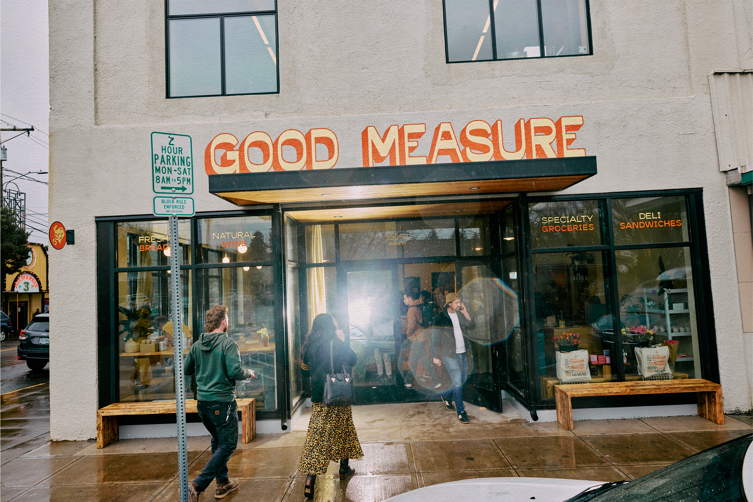
When dear friend and neighbor, Brooke, asked for help creating a brand package for her new café and market, the answer was obviously a resounding “hell yep.”
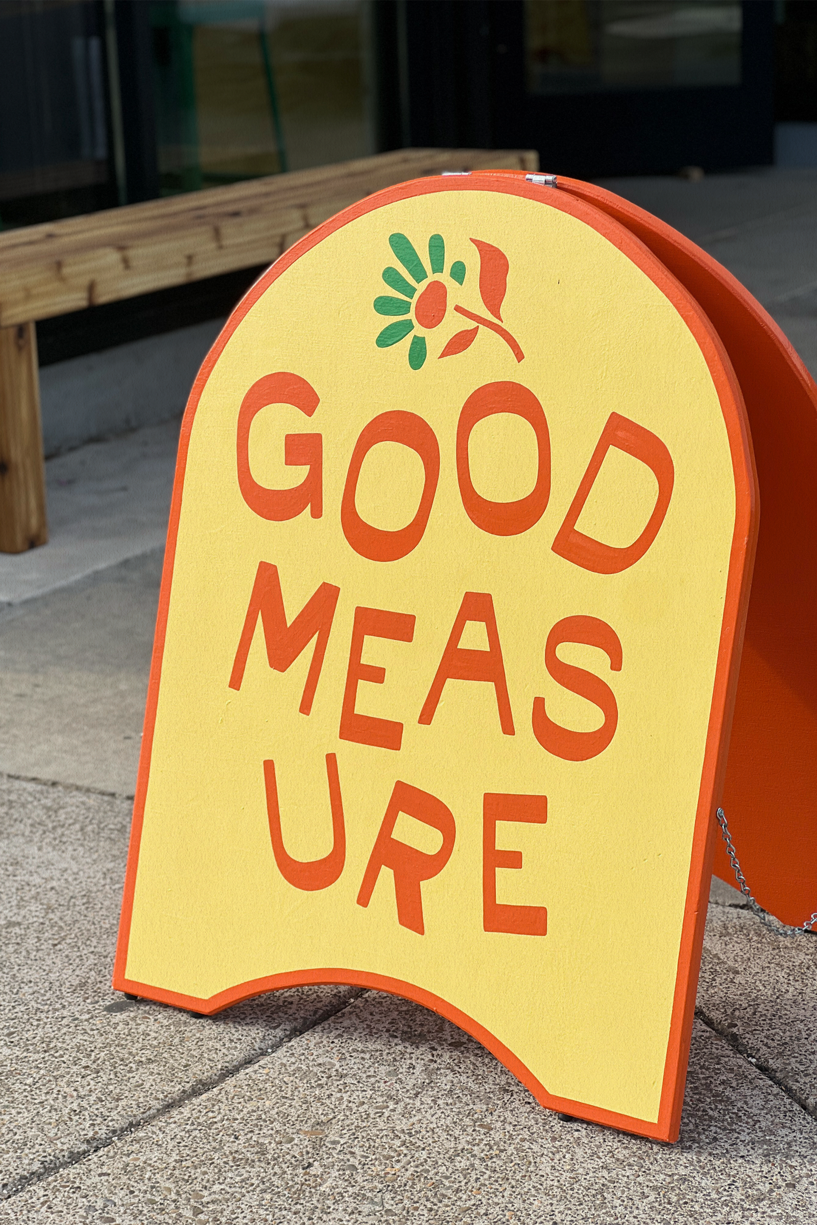
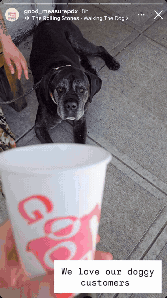
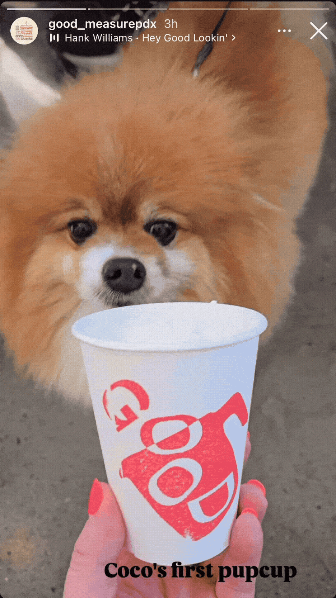
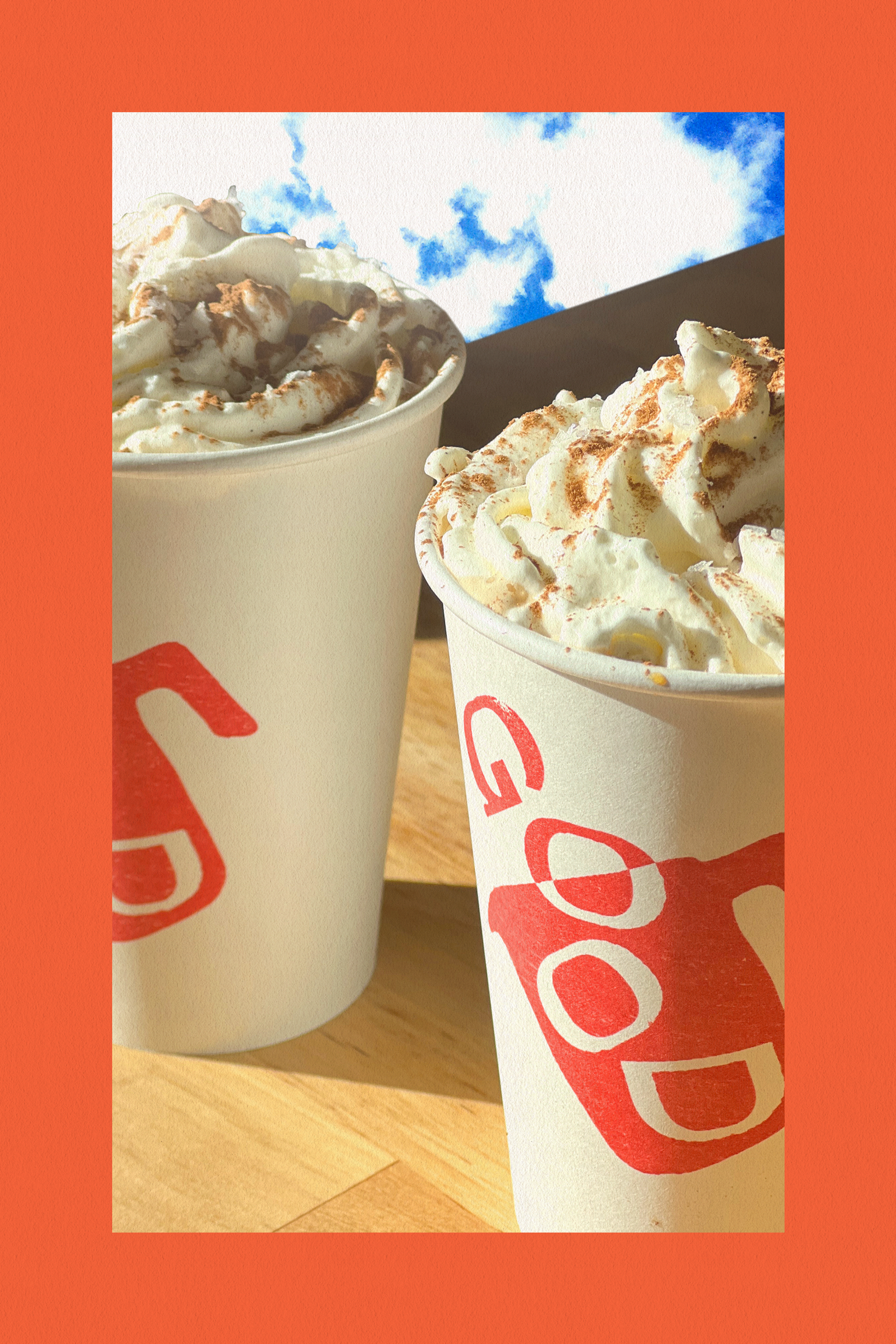
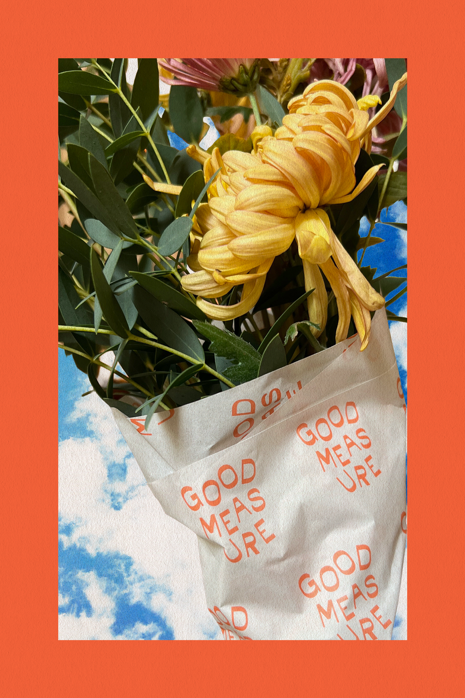
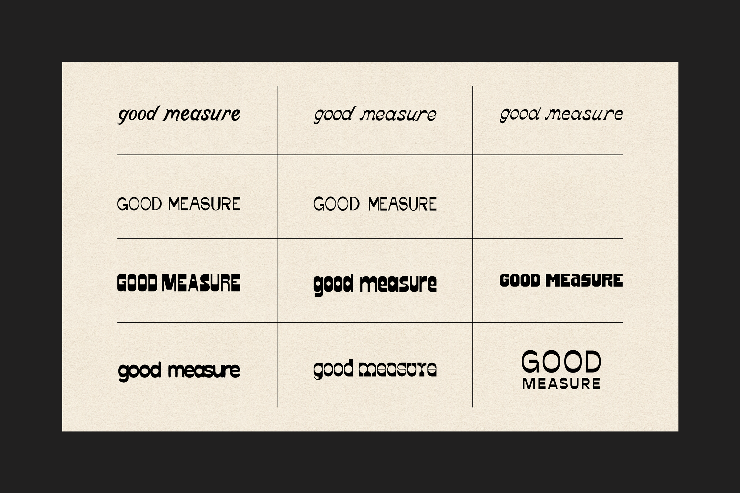
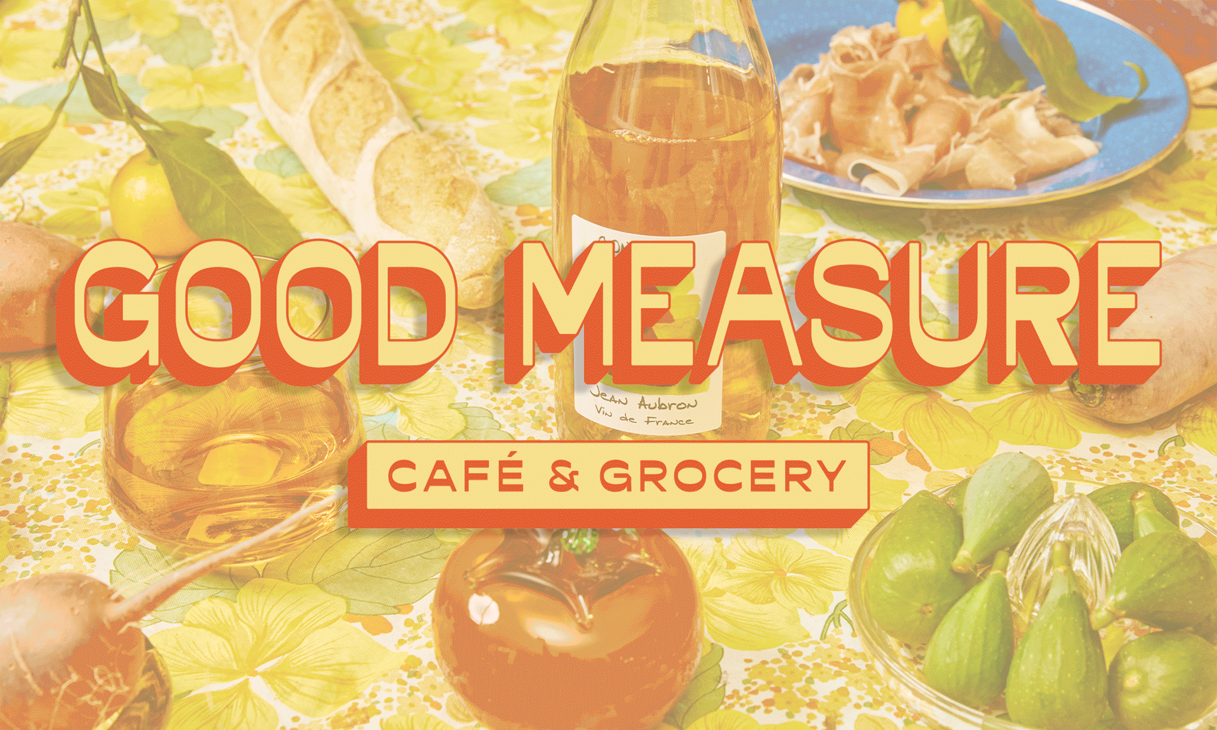
And since opening a community-driven small business was a lifelong dream for Brooke, it seemed appropriate for the brand to create something that was completely hers. The brand identity revolves around a tidied-up, hand-drawn reverse contrast wordmark. The end result was meant to feel clean, punchy, and just a little left of quirky.
Endless thanks to Michael Raines for the incredible ongoing photography, Kirsten Bauer for the flawless sign-painting (and letting me tag along to help!), and to Hensel Studio for tying the bow on the web design.
PROJECT INVOLVEMENT:
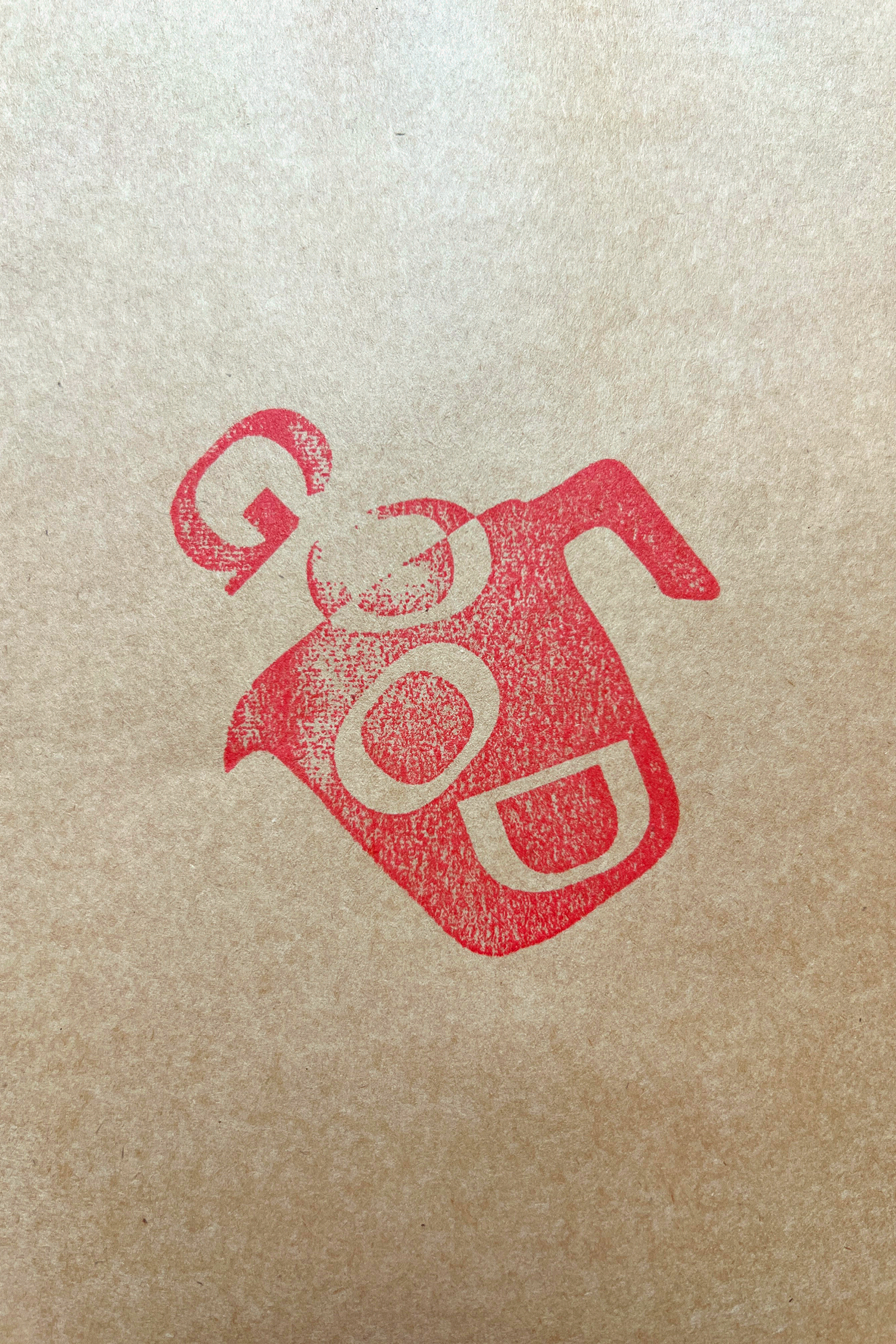
Brand Identity
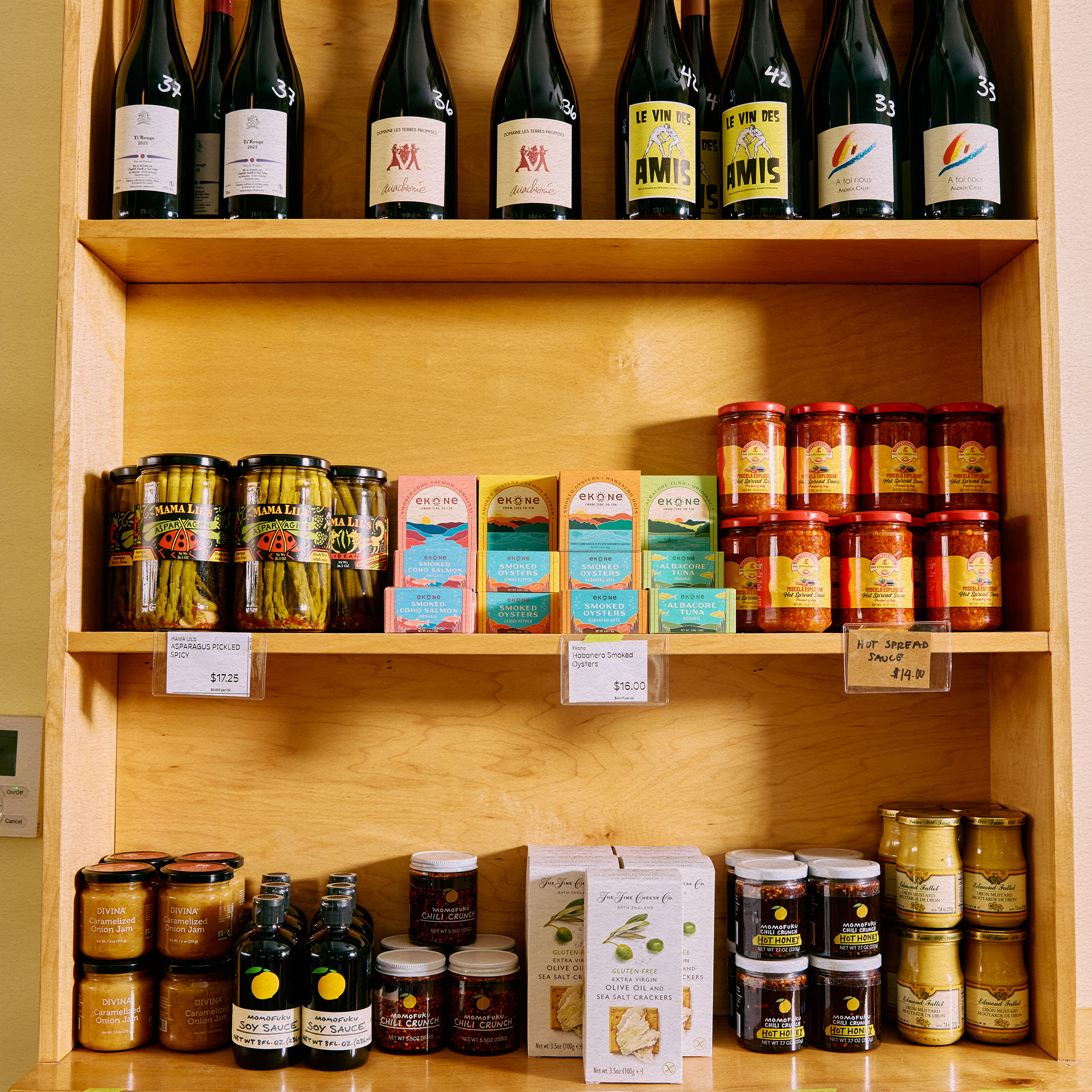
Signage & Environmental Design
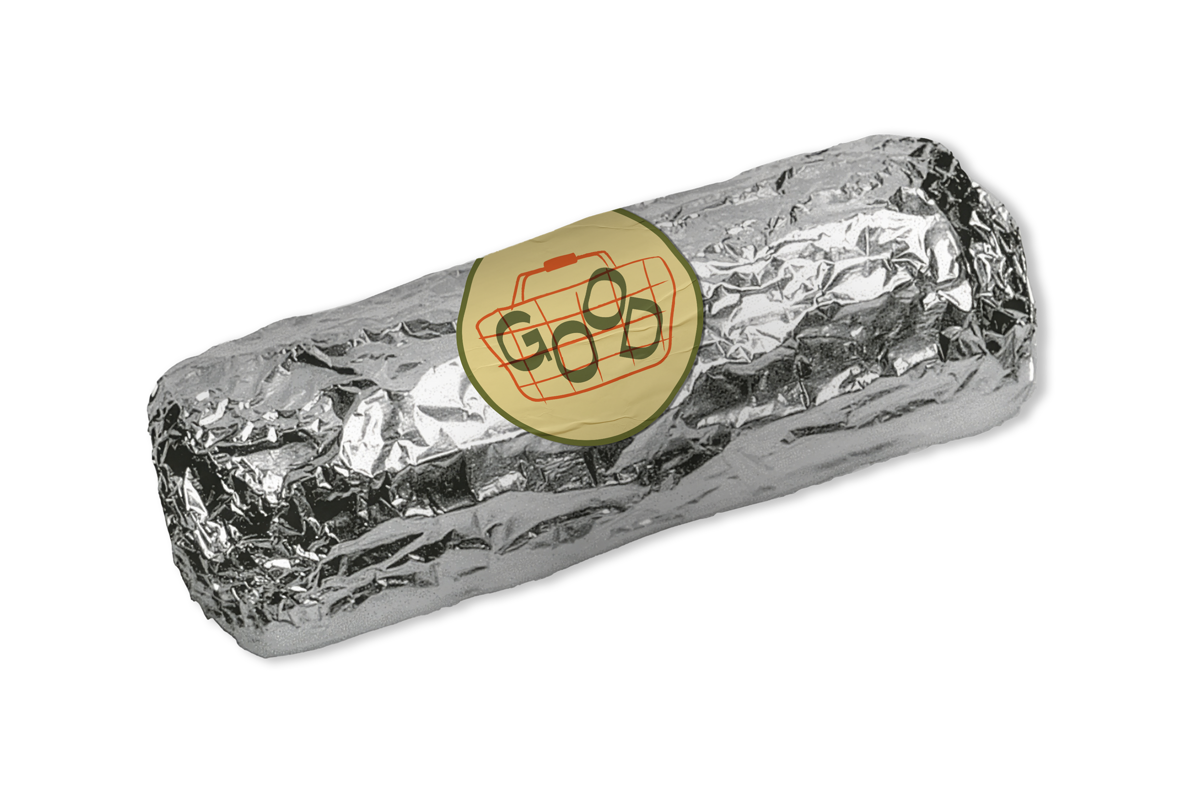
Merch Design
Menu Design
Minor Singpainting